Dow Jones | 44,094 |
S&P 500 | 6,204 |
Nasdaq | 20,369 |
2 Yr Treasury | 3.72% |
10 Yr Treasury | 4.24% |
10 Yr Municipal | 3.21% |
High Yield | 6.80% |
Dow Jones | 3.64% |
S&P 500 | 5.50% |
Nasdaq | 5.48% |
MSCI-EAFE | 17.37% |
MSCI-Europe | 20.67% |
MSCI-Pacific | 11.15% |
MSCI-Emg Mkt | 13.70% |
US Agg Bond | 4.02% |
US Corp Bond | 4.17% |
US Gov’t Bond | 3.95% |
Gold | 3,319 |
Silver | 36.32 |
Oil (WTI) | 64.98 |
Dollar / Euro | 1.17 |
Dollar / Pound | 1.37 |
Yen / Dollar | 144.61 |
Canadian /Dollar | 0.73 |
Macro Overview
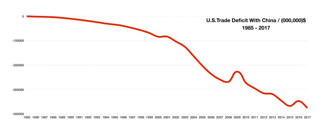
Markets were rattled in March as a looming trade war between China and the U.S. enhanced market volatility. The administration announced $60 billion in tariffs for Chinese imports, with a detailed list of products which will be identified by the Commerce Department in April. China threatened to retaliate by imposing tariffs on U.S. imports as well as curbing U.S. Treasury purchases.
Intricate supply chains have evolved between the United States and China over the past twenty years. Some U.S. manufacturers ship U.S. made components to China for final assembly, then ship finished products back into the U.S., thus posing a challenge as to how trade deficits are calculated.
Key economic data released over the past month revealed that key data points were the strongest reported since 1998. The market has become much more dependent on data as it looks for signs of inflation and rising rates. Various analysts view current market volatility primarily driven by non-systemic events and isolated to specific events and individual company news.
A key lending benchmark, the Libor, has been rising steadily. The three-month U.S. dollar Libor rate surpassed 2% in early March, the highest level since 2008. Based in London, the Libor affects U.S. consumer loans, commercial loans, and adjustable rate mortgages.
Rapidly rising mortgage rates are dampening the hopes of families eager to lock in rates before payments start to become too expensive. The continued lack of housing supplies has added a double cost factor to the market, with prices elevating due to tight supplies and rising mortgage rates.
The International Energy Association (IEA) projects that the United States is on track to become the worlds single largest oil producer by 2023. The estimates are based on production growth and supplies generated by U.S. energy producers over the next few years. U.S. daily oil production alone is expected to reach over 12 million barrels per day by 2023, a 20% increase from the current levels of 10 million barrels per day.
Congress reached a $1.3 trillion budget deal that will fund the federal government through September. The extensive 2,232 page bill averts a government shut down and funds special programs for child care, infrastructure, medical research, opioid abuse prevention, and national security.
The IRS audited roughly 0.05% (half of one percent) of the 195,614,161 returns filed for tax year 2016. The number of examinations, also know as audits, was higher in the mid 1990s, when about 1.7% of returns were audited.
Sources: Dept. of Commerce, Bloomberg, congress.gov
Tech & Tariff Influenced Volatility – Equity Update
Technology stocks led volatility in the first quarter, pulling other sectors into trading frenzies. Over 25% of the S&P 500 Index is currently comprised of technology stocks, having added volatility to the index for the first quarter. Trade war rhetoric added to volatility as U.S. companies sensitive to higher import prices on raw materials and certain finished goods experienced pullbacks.
Companies in the technology sector faltered as privacy concerns drove social media shares lower. The technology sector has also became more prone to volatility leading to gyrating valuations. In addition, news of heightened regulatory rules for technology and social media related companies escalated a sell off heading into the second quarter.
Transportation stocks are rising more closely with the rest of the market, an optimistic signal according to the century old Dow Theory. Sources: Dow Jones, S&P, Bloomberg
Volatility – Where Do We Go From Here?
“Rising bond yields. Full employment. Fed tightening. Trade frictions. Weak dollar. Rising twin deficits, spurred by tax reform. Sound familiar? It should. This was 1987. Start rebalancing”
This is a quote from Gluskin Sheff’s David Rosenberg about the fundamental similarities between todays markets and those of 1987 (right before the big crash). CNBC reporter Art Cashin made a similar statement saying the recent volatility reminded him of 1987. After a 2017 that saw almost no volatility, we are on track for a year with over 100 days of 1% moves. This is unprecedented and could be a signal of rough times ahead. Generally when you see this type of market action it means we are headed for a big breakout – unfortunately it doesn’t tell us which way. It is however rare to see this type of volatility and then see a market that trades sideways or moves slowly up or down.
The economy still feels solid and earnings are strong, but this is almost always the case before the bottom falls out (think 1999, 2006). The Fed tightening cycle has begun at the same time we are sitting with an unprecedented amount of debt (both macro and micro). The Fed has very few bullets to fire should we get a major breakout to the downside. Bank of America Chief Investment Strategist has called the technology sector the 3rd largest bubble in the last 40 years. Of course all of this has been fueled by central bank “stimulus” which resulted in the lowest interest rates in 5000 years! Well, rates are rising, we are levered to the gills in nearly every market and it could be time to “pay the fiddler”. Because volatility was historically low in 2017 the recent spikes feel massive but the reality is that we are approaching historical norms. However, given how tightly things have become wound investors should expect and be ready for continued market volatility and it wouldn’t surprise us if we see an acceleration of volatility with some even larger spikes throughout the rest of 2018.
Fixed Income Overview
Equity market volatility in March drove assets towards various sectors of the bond market, thus pushing yields slightly lower and various fixed income prices higher.
A key leading rate, the Libor, rose the most in 10 years. Debt reliant companies and consumers with variable rate loans tied to the Libor are most susceptible. The three month Libor rate rose to 2.31% at the end of the quarter. The six-month Treasury bill reached a yield of 1.88% in early March, an important yield because that’s exactly what the S&P 500 Index yields. Some income seeking investors may begin to view short-term bonds as an attractive alternative to dividend paying stocks prone to market volatility.
The Federal Reserve decided to raise the Fed Funds rate to a range of 1.5 – 1.75%, on track for another three rate increases this year. Language from the Fed Chief Jerome Powell shed some optimism on economic activity, noting that “the economic outlook has strengthened in recent months”, warranting further increases in the Fed Funds rate. Sources: Federal Reserve, Bloomberg
The Yield Curve
A yield curve is a line that plots interest rates at a set point in time, of bonds having equal credit quality but differing maturities. In other words, it is the difference between short and long maturities and the most important and commonly used yield curve is the 2’s to 10’s (2 year treasury vs. 10 year treasury). Below is a chart of this yield curve with the price of the S&P 500:
The yield curve is the white line (blue shaded area) and the S&P is represented by the red line. As the chart illustrates, the yield curve has been steadily declining and currently sits at 46 basis points. This means an investor purchasing a 10 year bond is receiving 0.46% more than if they bought a 2 year bond. The reason this is so important is that it is one of the most reliable indicators of where the economy is heading (and therefore stock prices). The chart clearly shows that when the yield curve inverts (2yr treasury is higher than the 10yr) a major sell-off in stocks occurs very shortly after. We aren’t quite there yet but investors should keep their eyes on this relationship and as it gets closer to inverting be ready to take some serious money off the table.
See the next page for a an update on the credit markets and spreads.
Credit Markets
As our regular readers know, we have discussed credit spreads in nearly every issue and feel it is time to look a little deeper this month. A quick explanation for our new readers is in order. Spread is the yield differential investors receive above the risk-free treasury rate for purchasing the debt (bonds) of non-governmental issuers such as corporations or municipalities. For example, if the 10 year treasury rate is 2.75% an investor purchasing a 10 year bond issued by a corporation might demand a 100 basis point risk premium to compensate them for the possibility of default and would buy the bond at 3.75%. This premium is generally expressed in basis points. A basis point is one hundredth of a percentage point so 50 basis points is 1/2 of one percent. The worse the credit profile of the issuer the more risk premium an investor should demand. For instance an A rated corporate bond will pay investors a lower risk premium than a B rated bond. Historically, investors have demanded a very large risk premium for investing in lower rated securities. So where are we today?
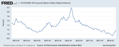
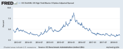
The top graph shows the spread on investment grade (IG) corporate bonds while the bottom graph is the spread on high yield (HY) corporate bonds. At first glance they look similar, the key is to look at the scale on the Y axis. The IG chart runs from 80 basis points to 220 basis points (0.8%-2.2%) while the HY chart covers an area from 250 basis points to 1000 basis points (2.5%-10%). Looking at the charts you would think that IG spreads have spiked significantly but again this is due to the scale, the actual move is only 26 basis points. What is clear however is that spreads on both IG and HY bonds have been steadily moving lower since the spike in 2016 and if we were to expand these charts to 10 or 20 years you would see that we are at or near historic lows. This means that investors are currently receiving one of the lowest risk premiums in history. We have discussed in detail on our website the reason for the low spreads but the main culprit has been central bank intervention meaning that central banks have been continuous buyers of world-wide debt of nearly every type (quantitative easing). However, central banks are now beginning to unwind their balance sheets (or at a minimum slow their purchases) and it doesn’t require a Ph.D in economics to guess how that will affect bond pricing and spreads in the long run. Now let’s look at several data points to understand the current relationship between IG and HY spreads.
Next Page – Risk Premium
Risk Premium
As noted on the previous page, risk premium (spreads) have been steadily falling since 2016. Now let’s examine this relationship and see what it may be telling us. The chart below shows the spread on both IG and HY bonds for various points in time since 2000 and the difference between the two:
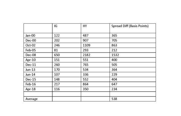
The difference between investment grade and high-yield currently sits at 234 basis points meaning investors are receiving 2.34% more compensation for investing in HY vs. IG rated bonds. As the chart shows, there have only been two other periods that this spread was lower. The average spread using these data points has been 538 basis points or more than double the current risk premium. Examining this chart more closely you will notice a not so obvious but very important trend. Two times in the last 20 years the spread differential between IG and HY has been below the current level of 234 and both times signaled a major widening in the relationship within 3 years. In 2005, the spread difference reached 212 basis points and by 2008 it was an astounding 1532 then again in 2014 the credit spread reached 229 and by February of 2016 it was 647. To put this in perspective, if you owned $100k of a high yield bond with a 7 year maturity the approximate decline in value would have been $51,000 in 2008 and $21,000 in 2016 based solely on the spread differential.
There is a major difference between previous credit cycles and todays 234 basis point spread – SUPPLY. Global debt now sits at approximately $230 trillion which is over 300% of global GDP and up a whopping $80 trillion since the 2008 credit crisis. Much of this debt has been high yield and is set to mature over the next 2-3 years. Considering rates are rising (increasing borrowing cost) and central banks are beginning to unwind and become net sellers instead of buyers, the question everyone should be asking is who will be left to buy this debt when things begin to unwind. Bonds are not like stocks with a liquid two sided market, when someone has to sell the price they receive is what someone is willing to pay and when all the buyers step away at the same time (as tends to happen in the bond market) what will happen to bond prices when the inevitable blow up finally arrives? Hint: You don’t want to be the one forced to sell.
What Does It All Mean?
We have demonstrated that the yield curve is flattening with the 2’s to 10’s spread sitting at 46 basis points and that investors are receiving a historically low risk premium of 234 basis points for purchasing junk rated debt over investment grade debt. Fixed income investors should realize they are not being compensated for taking both time risk and credit risk and should be looking to shorter maturities with higher credit ratings and be willing to accept the slightly lower returns in the short run to avoid massive pain in the long run. Duration is a measure of risk in bonds and every fixed income investor should know the duration of their portfolio holdings. Long maturity bonds have a much higher duration than short maturity bonds and therefore carry much more risk. Without going into a major discussion in this issue of duration this example should make it clear. A 2 year treasury bond has a duration of around 1.9 meaning that for every 1% move in interest rate the price of the bond moves 1.9%. The 10 year treasury has a duration of 8.6 so a 1% move means the price will move 8.6%. If you are only getting 0.46% reward for taking over 4 times the risk it should be obvious that the reward is not worth the risk. In dollar terms using today’s on the run treasuries a 1% move in interest rates the price of a 2 year bond will move about 2 points or $2,000 for every $100,000 invested and a 10 year bond will move about 8 points in value or a loss of $8000 for every $100,000 invested.
Since bond prices move inversely to yields, and the yield curve is continuing to flatten investors are betting that the price of the 10 year will increase as long rates go lower in the short term and the price of the 2 year will decrease as short rates rise. This is a bet that is better left to professional money manager or hedge funds and there are far better ways to play this for retail investors which we will discuss on the last page of this newsletter in the “Conclusions and Recommendations” area but here is a hint, you don’t want to be this guy!
The Growing Trade Deficit With China – International Trade Policy
Over the past twenty five years, China has evolved from a heavy equipment and machinery exporter to a prominent leader in technology product exports. Large international conglomerates have established an enormous manufacturing presence throughout China, utilizing its cheap labor and quick turn around times. China’s manufacturing plants are among the most modern in the world, producing large capacities almost entirely for export.
As the world’s appetite for electronic devices has grown, so has China’s ability to manufacture and export these devices. As a product exporter, China is able to manufacture and export finished products worldwide. In addition, China is also an exporter of components, which may be used in the manufacture and assembly of products in other countries, such as the United States. By exporting components in addition to finished products, China is able to hedge against tariff issues and labor costs should they become a factor.
Trade with China has grown tremendously over the past 30 years, from nearly a trade balance in 1985 to a trade deficit of $375 billion in 2017. Imports from China were $506 billion while U.S. exports to China were $130 billion, thus an ensuing trade deficit.
Ironically, China’s purchases of U.S. government debt has helped maintain a low interest rate environment, thus reducing loan rates allowing U.S. consumers to finance more expensive Chinese imports such as big screen TVs, cell phones and computers. Sources: WTO, IMF, U.S. Dept. of Commerce, FRED
Conclusions
So today we are at what can only be described as the precipice staring into the dark abyss – OK, well that is a little dramatic but the reality is we have a flattening yield curve, historically tight credit spreads, central bank tightening, and a record $230 trillion in global debt. Investors have deluded themselves with that this time is different – that the so called “synchronized global recovery” will be able to outgrow the real structural problems. Economic growth remains relatively strong, earning have been great and tax cuts should help boost the economy. Tune into CNBC on any given day and you will be treated to and endless array of analyst and investment managers telling you that “you have to own stocks” if you want to succeed and it is all going to be “unicorns and rainbows”. Of course these same professionals told us the dot.com bubble was going to turn out great in 1999 and that housing could never go down in 2005-2006. However any sane investor should realize that tax cuts will likely cause larger deficits, debt will continue to smash records, and the central banks are tightening (albeit slowly). We have an increasingly unstable global political environment, trade negotiations (which could easily become trade wars) and complete chaos in Washington. Worldwide debt now sits at over 300 times global GDP and is simply unsustainable and rising interest rates will make servicing this debt increasingly expensive and unsustainable. We can’t know what the impetus will be or the exact tiiming, but we will bet that almost nobody will see it coming. It could be some obscure bank nobody’s heard of defaulting or some over-levered hedge fund that triggers a domino effect or some event that nobody is even talking about but it will happen.
Recommendations
For stock investors we recommend maintaining a cautious stance. If you have been invested in stocks it is likely you have large profits and you may consider lightening up and taking some profits, especially in the more volatile tech names that have had tremendous runs. Many of these names (Netflix, Amazon, Tesla) have had once in a lifetime runs and are trading at multiples reminiscent of the dot.com bubble. As we stated a Bank of America analyst recently called the current tech market the 3rd largest bubble in the last 40 years. If you must own stocks keep the quality names with reasonable valuations and if possible keep them tightly hedged with long dated options or keep tight stops.
Fixed income investors can still find tremendous value in the short end of the yield curve and in sectors such as mortgage and asset backed securities. Many of these securities return monthly principal which means every month you are reducing risk by simply getting money back. Even in the short end of the curve there are attractive yields to be had for knowledgeable investors in the 4-5+% range. Of course this isn’t the 20% annual returns many investors have become accustomed to but you aren’t risking 50%+ losses should things get really ugly. It is one or the other folks, be ready for both!
It is one or the other folks, be ready for both!