Dow Jones | 42,270 |
S&P 500 | 5,911 |
Nasdaq | 19,113 |
2 Yr Treasury | 3.89% |
10 Yr Treasury | 4.41% |
10 Yr Municipal | 3.31% |
High Yield | 7.26% |
Dow Jones | -0.64% |
S&P 500 | 0.51% |
Nasdaq | -1.02% |
MSCI-EAFE | 17.30% |
MSCI-Europe | 21.20% |
MSCI-Pacific | 10.50% |
MSCI-Emg Mkt | 8.90% |
US Agg Bond | 2.45% |
US Corp Bond | 2.26% |
US Gov’t Bond | 2.44% |
Gold | 3,313 |
Silver | 33.07 |
Oil (WTI) | 60.79 |
Dollar / Euro | 1.13 |
Dollar / Pound | 1.34 |
Yen / Dollar | 144.85 |
Canadian /Dollar | 0.72 |
Macro Overview
Markets continued on a volatile course in April following announcements regarding tariffs, rising rates, and geopolitical tensions, yet some economists and analysts expect that a tax cut driven rebound is possible.
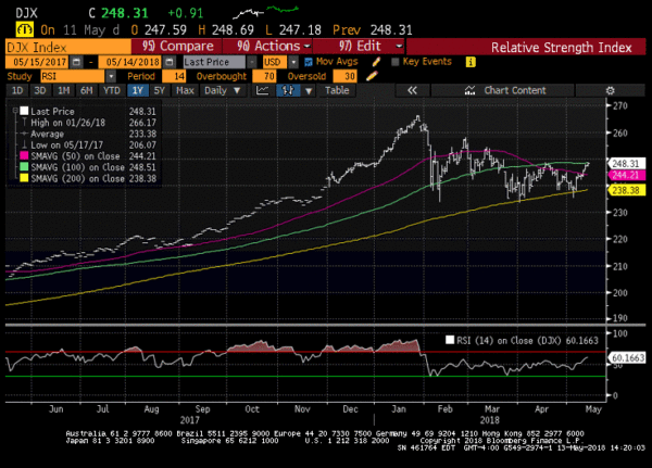
The 10-year Treasury bond yield reached 3% for the first time since January 2, 2014, elevating inflationary fears and the onslaught of rising loan costs. The 3% mark represents a psychological hurdle that influences the dynamics of various fixed income sectors.
The market is concerned that the Fed and other central banks may need to take additional actions in order to alleviate a rapid rise in prices and wages should it materialize. Federal Reserve members voted not to raise rates during their May 1-2 meeting, yet are still on track to raise rates in June and perhaps twice more before year end.
Stocks have been trading in what traders call a trading range, meaning that prices move down and up but stay within certain levels. The release of earnings has become a key determinant of prices as the market looks for fundamental validations for pricing stocks. Company earnings in certain sectors have increased the most since 2010 while the environment for selecting stocks has become tactical and very selective, shying some investors away from the major indices.
The U.S. Treasury issued $488 billion in government bonds for the first quarter of 2018, the most since 2008. The issuance is in anticipation of a drop in tax revenue from the recent tax cuts. Some economists believe that the benefits of the tax plan have not been realized yet as it may take months for visible benefits to appear.
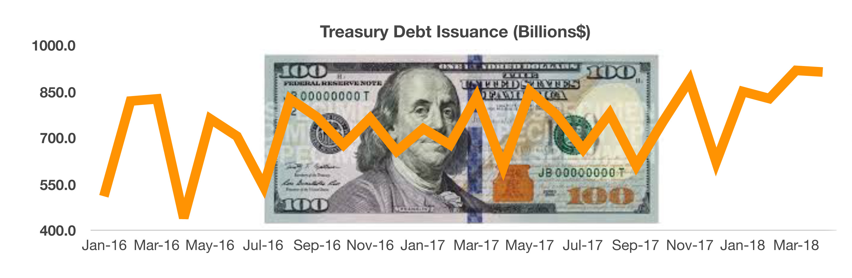
Oil prices reached their highest levels in more than three years as geopolitical tensions drove uncertainty. Shrinking supplies and the approaching summer driving season are expected to heighten gasoline prices across the country.
The most recent data from the Department of Commerce revealed that GDP grew at an annual rate of 2.3% for the first quarter of 2018, a deceleration from the 3% growth that occurred in the final 9 months of 2017. Encouraging data released by the University of Michigan reveals that consumer sentiment rose in April driven by favorable views on personal finances and incomes.
Sources: Dept. of Commerce, Fed, U.S. Treasury, BLS
Stocks Enter A Trading Range – Equity Markets Update
Markets rebounded in April as fundamental factors drove prices higher. Among the factors influencing the markets were global expansion, positive domestic activity, increasing earnings, and capital spending increases.
Stocks traded sideways, with the S&P 500 temporarily trading below its 200-day moving average in early April and then bouncing back toward the middle of its recent trading range. This technical narrative is essentially positive, meaning that the market bounced from a low upward towards possible new highs.
Market watchers have termed the drop in equity prices in early February as a “shock drop”, resembling reactions driven by human behavioral activity. Since the initial down turn in February, there have been several intermediate-term downturns, alluding to fundamental weaknesses that have not materialized.
Correlations among various equity sectors has diminished as specific industries and companies are sought after rather than the broad indices. Analysts refer to this as a “stock picker’s market”.
Analysts raised their 2018 forecasts for revenue growth for S&P 500 companies to 7.2%, up from 5.4% in 2017. Financial and industrial stocks historically have seen earnings improvements during rising inflation and rising rate environments. Sources: S&P, Bloomberg, Reuter
Volatility and Direction
Its is great to hear about where we have been but the question is where we are heading. We are at a precarious level in the stock markets as this week we once again bumped up against the 100 day moving average in a downward sloping channel. The chart below shows pretty clearly where we sit. As you can see in the chart we have tested the 200 day moving average twice since March and are not pushing up against the 100 day moving average. If the market is going to continue this rally in the short term we need to see the market move above the 100 day and remain there, otherwise it is likely we re-test the 200 day again. After moving over 35 in February, the VIX has declined back to below 15 and is currently at 12.65. This should present a gift to equity investors looking to hedge stock positions as volatility determines options prices. If you are a stubborn long, it would be wise to look into insurance at this point.
10 Year Treasury Bond Hits 3% – Fixed Income Overview
The 10-year Treasury bond yield reached 3%, a psychological level for the bond market. Breaching the 3% mark is expected to pose lending constraints for businesses and consumers as loan costs rise. This will prove increasingly important as record amounts of debt is coming due in the next four years and will need to be refinanced. It is estimated that $1 trillion of this debt is high yield (junk) and higher rates and a tightening credit market could mean these companies will be unable to refinance leading to a wave of corporate bond defaults. We have written extensively about this in previous newsletters and believe it is beginning to play out.
The drop in bond prices has placed bonds as a more attractive option for income seeking investors since bonds are favored during periods of market volatility due to traditionally experiencing less volatility than stocks. Short-term rates and long-term rates are coming closer together, known as a flattening yield curve. Short-term rates are rising faster, which are highly influenced by the Federal Reserve’s rate increases. Long-term rates are established by the market as well as the expectation of economic growth and inflation.
The issuance of corporate debt by companies is increasing before rising rates heighten the cost to borrow above current levels. A demand for fixed income globally continues to fuel the issuance of new bond issues as well. Consumers and homeowners with loans tied to rising short-term rates, such as the Libor and Fed Funds rates, are expected to feel the effects of rising rates the most.
This is a one year chart of the 10 year treasury curve which shows we have moved nearly 100 basis points since September 2017. For the last few weeks we have flirted with 3% and have traded in a tight range between 2.8% and 3% for several weeks. Each time we have breached 3% we have quickly rallied back into the 2.90% area. If we break 3% and stay there it will be a significant technical level and could lead to significant short covering sending rates sharply higher.
NEXT PAGE – YIELD CURVE DISCUSSION
Yield Curve Update (Continued from last month’s issue).
Last month we examined the widely followed 2 year to 10 year yield curve and its relationship to the stock market. At the time the 2’s to 10’s curve was 46 basis points (down from 100 basis points in July 2017), it move temporarily higher to nearly 54 basis points but has since resumed its march lower and now sits at right under 43 basis points. This month we are moving further out the curve to examine the 30 year curve and its relationship to the 2 year and 10 year treasury. The chart below is the 2’s to 30’s yield curve (the difference in yield between the 2 year treasury and 30 year treasury).As you can see, in the early 1990’s the curve was on a steady decline from nearly 400 basis points to 15 basis points. On the graph you will notice a sharp decline that began on 9/30/1999 and bottomed on 3/31/2000. The yellow line repre
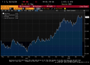
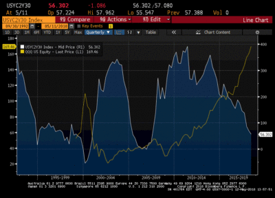
sents the Nasdaq (QQQ) and as you can see on nearly the exact date the yield curve began to fall, the QQQ began the famous “melt-up” going from $60 to $109 in six months. The Nasdaq hit that high on 3/31/2000, the exact day the yield curve bottomed at -54 basis points. The divergence between the 2 could not be more obvious, and as the QQQ went on to fall from $109 to $20 the yield curve went from -54 basis points to over 300. While not as pronounced, you can see that as the yield curve began to fall again in 2004, the Nasdaq began to climb from $36 to $51 in 2007 only to play out the same scenario as the yield curve rose steeply the QQQ lost 40% of its value falling to under $30. Now look at the where we are today – The QQQ is at $169, just below an all time high of $174 we reached in March and the yield curve has taken a nosedive. The difference this time is the length of time the yield curve has been falling and stocks rising and how much more massive the divergence is now compared to previous bear markets. The logical explanation for this has been the massive amount of central bank interference as global central banks have piled on trillions in debt to purchase financial assets (stocks and bonds). This yield curve relationship is perhaps the most reliable indicator of where the markets are headed in the future and investors should position themselves accordingly.
Besides the obvious implications for the stock market, the other takeaway from this graph should be that bond investors are not being rewarded for the time value of their investments. If you are only getting 56 basis points (about half a percent) for investing an additional 28 years it makes absolutely no sense to be in longer dated fixed income securities. The spread between 10’s and 30’s has shrunk to 13 basis points which is also near historical lows. What sand person would invest their money for an additional 20 years to get an extra .013%? Now lets do our monthly examination of credit spreads which should further reinforce our position that it is time to stay away from risk positions.
Next Page – Credit Spreads
Credit Spreads & Risk Review
We spend substantial time in our April newsletter explaining the credit curve and illustrated that investors are currently being offered one of the lowest premiums in history for taking risk. If you missed it, please visit the website and read the archived copy for a full explanation of credit spreads and to view the historical spread charts. To avoid redundancy for our regular readers, we will just review changes since our last newsletter. In April, high yield actually outperformed investment grade bonds. HY began the month with an option adjusted spread of 377 basis points and closed at 346 bps for a 31 basis point rally (tightening). Investment grade bonds opened the month at 117 basis points and closed at 114 bps for a whopping 3 basis point rally. Do not let this complacency fool you, as we demonstrated last month, the spread differential between HY and IG is at historic lows. Last month we showed the spread between HY and IG was at 234 bps and now sits at 232 bps. That means you would get 2.32% more for buying a junk bond than you would for purchasing an investment grade bond, not nearly enough for the possible default and price risk.
TESLA ALERT
We wrote last September (and nearly every month since) that the Tesla corporate bonds issued last August were possibly the best representation of credit markets gone mad. We warned investors to stay away from this issue and believe that it is indicative of investors lack of concern for real risk as they chase yields to unsustainable levels. So lets review the TSLA 5.3% of 8/15/2015. These were issued at par and investors engaged in a food fight over the bonds causing Tesla to upsize the issue by several hundred million to meet investors insatiable need for yield. These bonds were unsecured with almost no covenants to protect bondholders. These bonds have steadily declined in price and are now trading at $87.92 for a paper loss of 12% (excluding coupon payments). This is not meant to be a commentary of the quality of Tesla cars, they may actually be the greatest car ever produced as many owners seem to believe but to illustrate the complete disregard for risk of institutional investors who have been forced to chase yield at any cost. This was a $1.8 billion dollar issue meaning there are $216 million in losses on the balance sheets of the institutional holders (this was a private placement and therefore unavailable to retail investors). At the current price the bonds are yielding 7.45%, if you read our previous newsletters we wrote that in our opinion the bonds should have been issued at over 10% to reflect the risk and in less than a year we are halfway there. The bonds have been downgraded Moody’s to Caa1 and have a recovery rating of 3 (meaning they believe investors would recover 60% of par value in liquidation). We believe that due to the downgrade in an normally functioning market these bonds would be trading between 12-15% which means they would have to fall another 21 points from current levels before they would accurately reflect the risk of default. It doesn’t help to have a CEO who hangs bankruptcy signs around his neck as an April fools joke and routinely refuses to answer tough questions on conference calls and ridicules analyst that ask questions he doesn’t like. Amazingly, the stock has held steady in the $300 range. Generally, the bond market gets it right and is ahead of stock traders on valuations so this precipitous price drop could be signaling dark days ahead for TSLA shareholders.
What Maturities Have The Most Value?
So now that we have laid out the case for staying with short, high quality fixed income investments let’s look at where we see value and where fixed income investors should be looking to find acceptable yields without unnecessary risk. The flat yield curve means you are not being rewarded for moving into longer maturity bonds and we believe the “sweet spot” is 1-3 year maturity range assets. To illustrate the difference in risk between short and long maturity bonds lets look at 2 year treasury vs. 5 and 10 year treasury and calculate price moves for a 50 basis point move up in rates. The 2 year treasury is currently trading at $99-22 (2.54% yield – bonds are priced in 32nds – 1/32nd is known as a tick so the $99-22 represents $99 + 22/32nds). The 5 year is trading at $99-18 (2.84%) and the 10 year is trading at $99-5/32 (2.97% yield). So you can earn 2.54% for 2 years or 2.97% for 10 years, without knowing the price volatility that should be a no brainer.
So what happens if rates rise 50 basis points? The 2 year treasury loses less than 1 point and would be $98-24. The 5 year treasury loses around 2.25 points and would trade at $97-12. Finally the 10 year loses over 4 points and would be trading at a price of $95-2. For perspective, on 100k invested a 2 year investment would lose less than $1000, a 5 year would lose around $2250 and the 10 year would lose over $4000. Just for fun and because many readers probably own longer bonds (brokers make more selling longer bonds than short) a 30 year bond would lose over $9000. Again, this is just a 50 basis point rise in interest rates which is not historically large. We have already moved 100 bps on the 1o year in the last 6 months alone!
Value In The Credit Curve
Hopefully, how you will agree that shorter is better in the bond market under current conditions. We also earlier established that the credit curve is historically tight and made the point that investors should stay in high quality bonds as they are getting historically low spread to go further down the credit curve. If 50 basis points moves a 1o year down 9 points, imagine what a 10 year high yield bond that widens 200-300 basis points at the same time would decline in value. Again, lets look at the TSLA bond we discussed earlier. If rates rose 50 basis points and the bond widen to a more historically normal spread of 600 -700 they would drop in price an ADDITIONAL $15 points from their current already depressed level of $87 and trade in the low $70s (and it is only a 7 year).
Where Is The Value?
So what do you buy? We still like short duration (1-3 year) high quality mortgage and asset backed bonds. On a year to date basis these bonds have outperformed corporate securities, many sectors of ABS have actually tightened as similarly rated corporate bonds have widened 20-30 basis points. We have been on this trade since the beginning and in the last week several very large money managers and hedge funds announced they were moving from corporate bonds to bonds backed by hard assets. Many of the bonds return principal and interest monthly so if we do get the impending credit blow up investors have a constant flow of money to reinvest at higher rates. By choosing the right bonds and performing the proper analysis it is also possible to all but completely eliminate the possibility of default.
We believe there is a coming credit crisis and that corporate debt will be the catalyst so investors will fare much better owning bonds backed by large pools of hard assets (mortgages, autos, consumer receivables, etc.) than the word of Elan Musk that he will pay you back. Due to their complexity, odd lots (small retail sizes $10k-100k) can be bought at substantial discounts behind institutional round lots and are currently yielding over 5% for investment grade bonds. We would caution investors interested in purchasing these securities to consult with and use an RIA firm that acts as a fiduciary and has no monetary incentive for placing trades on your behalf as bonds purchased through a broker-dealer can have significant commissions that will greatly reduce your expected returns (and being immediately underwater in any investment is never fun).
What Could Cost More In Retirement – Retirement Planning
As retirement nears for millions of aging baby boomers, the realization of how to pay for retirement becomes a challenge for many.
Expenses that one was accustomed to while still working and raising a family changes dramatically once retirement arrives. The biggest challenge for many is how to maintain the same lifestyle in retirement as during working years.
Unfortunately, many have realized that Social Security and menial retirement savings just aren’t enough to make up for lost wages. This either forces many retirees to seek part-time employment or merely live a less desirable lifestyle in order to minimize expenses.
Unforeseen expenses such as an illness not covered by Medicare or health insurance, home repairs, and emergency cash outlays may deplete valuable cash savings and derail what was thought to be a well executed financial plan. Retirees have found that liquidity during retirement is critical, thus avoiding the necessity to sell investments at gains or losses and even reducing income derived from them.
The biggest surprise that retirees are having is the increasing costs of drugs and healthcare. The Employment Benefit Research Institute has identified a number of expenses not necessarily planned for that are common among retirees: Special diets with foods and ingredients that may be more expensive than average, medical & toiletry items such as supplements and diapers, special transportation, medicare part A & B items not covered.
Sources: Employment Benefit Research, Social Security Adm., Medicare.gov
Personal Savings Rate Indicates Consumer Sentiment – Consumer Behavior
Federal Reserve data show that the average consumer checking account balance, a measure of consumer personal savings, has increased in 23 of the past 30 quarters.
Recent data from December 2017 through March 2018, illustrates an increase in the savings rate to 3.1% of disposable personal income as of March 2018. Economists view this increase as a possible pause in economic growth until consumers feel more confident about spending.
The Federal Reserve defines the personal savings rate as a percentage of disposable personal income (DPI), frequently referred to as “the personal saving rate,” and is calculated as the ratio of personal saving to DPI. Personal saving is equal to personal income less personal outlays and personal taxes.
Historically, Americans tend to save more as economic times become more difficult, and tend to spend during prosperous periods. Past slow downs such as in the mid 1970s and the early 1980s saw an increase in the savings rate, a barometer of consumer sentiment. The expansion during the mid-to-late 1990s saw a gradual drop in savings, as consumers spent more confidently as their incomes rose.
Sources: https://fred.stlouisfed.org/series/PSAVERT