Introduction
Sometimes the financial markets seem to offer up a gift that seems “too good to be true”. The forces that tend to create these trading opportunities can take years (0r decades) to come together and they can last for years. These opportunities are almost always the result of investor greed and ignorance and unfortunately for you to win someone is losing big. More often than not they are not widely known about and are beyond the scope of most retail investors (or even retail brokers and advisers) because they require special knowledge or access to certain markets. Of all the financial markets, the bond market is unique in its ability to create opportunistic situations that are as close to “no lose” propositions as one will ever find in the financial markets – with a risk/return profiles almost impossible to find in any other financial asset. The reason lies in several features that are unique to the bond market such as poor pricing transparency and the extreme disappearance of liquidity during times of crisis. But the main reason bonds can provide opportunities that do not exist in any other asset class lies in the fact that as long as an issuer does not go bankrupt, an investor in bonds will receive the full face amount of the bond at maturity. This can create a “floor” or worst case return that no other financial asset can offer. For example, if Amazon stock plunged 70% it might seem like a bargain but there would be no guarantee that it could not go lower or even to zero. While the risk/return profile may seem fantastic, there would be no floor on how low my investment could go, no time frame for when it may pay off and no guarantee of a positive return. In my nearly 3 decade long career working in institutional bond sales and trading, I have seen the bond market offer up a few of these “too good to be true” setups and a quick review of these might offer some perspective on why I believe this current opportunity makes sense.
The 1994 “Bond Massacre” – In 1994, after years of consistently lowering interest rates, the Fed surprised the markets by beginning a rapid series of large rate increases sending bond prices plummeting. One specific structure type within the relatively new and still not fully understood collateralized mortgage obligation market was taking a real blood bath – the Inverse Floater. Inverse Floaters are floating rate bonds whose coupon has an inverse relationship to interest rates – as interest rates fall the coupon resets higher and vice-versa. It was a great play for years as rates fell and public funds rushed in to buy these bonds – many with coupons of well over 20%. Rising rates sent prices plummeting, dropping in some cases by over 50% in under 1 year. These bonds were backed by collateral that was guaranteed by agencies of the U.S. Government but headline risk and the massive, uniform exodus meant sellers couldn’t give them away. The coupons eventually went to zero – in a normal market these would have traded at a slight discount to zero coupon U.S. Treasuries but with heavily invested public funds going bankrupt and cutting services it was complete chaos. Sellers were forced to sell at the worst possible time and the bonds were trading at a fraction of their true value. Investors finally stepped in and began buying these bonds at significant discounts to their true value and were rewarded with years of double digit returns on agency guaranteed bonds.
The “Great Recession” or Credit Crisis of 2008 – Most people know that mortgages had something to do with the credit crisis and if you saw the movie “The Big Short” you probably have some understanding of the role securitization played in the crisis. CMO’s, CLO’s, and CDO’s – a veritable alphabet soup of securities backed by assets (mainly mortgages) containing shaky collateral that was often fraudulent began to go bad. As things began to unravel, firms like Bear Stearns were forced to shut their doors as investors rushed to dump their non-agency MBS/ABS. Normally the big brokerage firms would step up and bid the bonds but they were going bankrupt themselves leaving the market in complete disarray. Liquidity dried up and bond managers were told by their bosses to get rid of their mortgage and asset backed securities but there were almost no buyers. If you had to sell, your bond was worth whatever someone was willing to pay which had nothing to do with the true value of the underlying collateral. Investors with the proper valuation tools and knowledge were able to model the collateral, run various loss scenarios, and then bid bonds from desperate sellers at levels so far below their true value there was almost no way they could lose. Bonds traded at pennies on the dollar and it was as close to a license to steal as you will ever see in the financial markets – almost all the top performing hedge funds from 2009-2013 were heavily invested in these bonds.
$30 Oil 2016 – For most people $30 oil was a gift as gas prices fell dramatically. Unfortunately for energy company bondholders the price of their energy related bonds was falling even faster. This opportunity was different from the previous examples for several reasons. The bonds of these companies aren’t backed by collateral as in the previous examples but only by the promise of the issuing company to pay. It was also unusual in the duration, the entire trade played out in a matter of months. This is a perfect illustration of how quickly liquidity disappear in the bond market and how the binary nature of corporate bonds can affect investor psyche causing prices to significantly overshoot in a crisis. Just like the previous examples, as the headlines got worse and the expert pundits lined up to declare oil would never go up again, bond managers came under intense pressure to reduce their energy related holdings.
Imagine thousands of fund managers in unison deciding to punt their oil bonds – we are talking billions of dollars collectively heading for the exits at once. Below is a price graph of the Noble Energy 5.95% of 4/01/2025 bonds and Noble Energy common stock (NE). Notice the rapid decline from over $100 in mid 2015 to under $50 in February of 2016 (most of the drop occurred in 2 months – from December to February.
Also notice how rapidly the price recovered once oil stabilized. There was less than a 3 month window for astute investors to make the play. While the herd was panicked and running for the exits the smart money was buying these bonds at a 50% discount and saw a 100% return in one year (plus the 5.95% coupon payments). The yellow line represents Noble Energy common stock and it is interesting to compare the performance of the stock with the bonds. Both the bonds and stock had roughly a 50% decline in value and both basically doubled from the bottom over the same period (which is rare, usually the stock lags for years). However, notice that today the bonds are still trading with a $90’s handle price while the stock is actually LOWER than it was during the energy “crisis”. Not only did the bonds outperform the stock, investors actually took less risk because their bonds were secured by the assets of the corporation and could reasonably expect something back in recovery should the company been forced into bankruptcy. Here again, we see the superior risk/return profile of bonds in a crisis situation.
We could have picked nearly any oil company and the chart would have looked similar, even the top names like Pioneer and Chevron saw 20-30% price declines over a similar period and had a similar quick recovery. Corporate bonds are “binary” meaning the bond will either pay off and you receive 100% of your principal back or the issuer goes bankrupt and you receive nothing – binary (all or nothing). Since bonds are senior to stocks and have a lien on assets, there is always the possibility of recovering some of your principal back (after several years of court proceedings) but the bond market tends to disregard possible recoveries in crisis situations and the prices swing accordingly. This is one reason why bonds often outperform stocks in crisis situations, once the panic ends and investors believe the bonds are “money good” prices return quickly to near pre-crisis levels even though the stocks languish or trade sideways or down for years.
Nuances of the Bond Market
The bond market trades differently than most other financial markets and it is these nuances that help to create the opportunities we are discussing. The bond market is much larger than the stock market and the major players are large institutions. Due to the nature of the buyers, bonds tend to trade in much larger sizes and there is a tremendous price penalty when trading small sizes. Here are some of the major nuances associated with the bond market.
Liquidity – As our examples illustrated, during times of high volatility liquidity can rapidly disappear. Unlike stocks, there is no readily available 2-sided market for many bonds, and the more complex or “off-the-run” a bond is the lower the liquidity. In volatile times, a bond can literally be worth whatever a buyer is willing to pay which can create opportunities to purchase bonds at distressed prices below their true or intrinsic value.
Size – The bond market is not nearly as efficient as the stock market and since most of the trading volume is done by large institutions sellers of smaller pieces can be punished severely. The bid price for $10 million of a bond may be several points higher than it would be for $10 thousand of the identical bond. Unfortunately, this discount rarely gets passed down to the retail buyers as trading desk and brokers will mark the bonds up and often sell it higher than what it would sell for as a round lot. So the small investor gets hit twice, when selling their bid is below the institutional price and when they purchase a bond they pay more than an institution would for the exact same bond.
Technical Expertise – In order to properly evaluate a bond takes expensive equipment and systems that take years to master and are simply out of the reach of most retail investors and even most brokers and advisers. Even if you know a certain opportunity exists (housing crisis), you would need to purchase a Bloomberg terminal for over $2,000/month and spend years learning to use it in order to be able to evaluate the bonds.
Awareness and Availability – Most investors do not follow the bond market close enough to be aware when these opportunities present themselves. In fact, given the lack of transparency it would be nearly impossible for an individual investor to follow the various sectors in the bond market. Another problem is that many of the best bond sectors simply aren’t available to individual investors. Even if an investor can overcome the above listed hurdles (liquidity, size pricing, technical expertise) they may find that bonds they want to purchase are not available through their broker-dealer. To prove this try calling an online broker and tell them you are looking for a 2-3 year BBB rated sub-prime auto ABS and see how willing they are to help you. I have called dealers where I kept accounts and told them I wanted to buy a specific bond from a specific dealer at a price that was already negotiated and they wouldn’t even execute the trade!
Important Concepts From Our Examples
Liquidity – When a bond sector falls out of favor liquidity dries up and prices tend to overshoot to the downside. There may be no readily available 2-sided market and a bond will be worth whatever someone will be will to pay for it.
Sector Disdain – When you can find a bond sector that is hated by investors, it is likely the liquidity is poor and bonds can be purchased below their intrinsic value.
Investment “Floor” – As long as the issuer stays in business, you will receive your principal back at maturity with at least a minimum return which can be calculated before making the investment.
Guaranteed Return, Shock Analysis, & Recovery – If the bonds are backed by the U.S. Government, the minimum return is guaranteed. If the bonds are backed by assets such as mortgages, investors with the right tools can analyze the bonds using extreme “shock” scenarios on the underlying collateral performance and calculate worst case returns. By understanding the collateral quality and how it may perform even under the worst economic environment possible, investors can bid bonds at prices that generate positive returns under the most strenuous of scenarios. Bonds issued by corporations are only as strong as the credit-worthiness of the underlying issuer and investors must determine possible recovery levels in the event of default.
Binary Nature of Bonds – As we discussed investors view bonds as “all or nothing” propositions which can cause prices to overshoot to the downside but recover quickly. Mortgage and asset backed bonds are not binary in that even if some of the underlying assets default, depending on the structure of the bond at its placement in the credit waterfall investors can still receive all or most of their principal back and this can be modeled before a bond is purchased.
Baby With The Bath Water – When a particular bond sector is doing poorly, it isn’t just the lower credit quality issuers bonds that suffer. When investors run from a sector they tend to throw the baby out with the bath water and even the higher rated companies with almost no chance of default will suffer. In the energy example, bonds from marginal companies like Noble, Transocean and Marathon dropped 50% or more but even companies with almost no chance of default like Chevron saw price declines of 20%. This can create opportunity for risk averse investors. During the credit crisis, it wasn’t just sub-prime MBS that took a beating, investors ran from every sector of ABS. Even AAA rated cards backed by credit cards or auto loans that were 99.99999% money good were trading with double digit yields.
Performance – In almost any crisis scenario, bonds tend to outperform stocks in the initial years of the recovery. Again, this is due to the binary nature of bonds. The minute investors begin to believe their bonds are “money good” the prices move quickly back to pre-crisis levels. The returns on the Dow from 2008 – 2012 were -33%, 18.8%, 11.02%, 5.53%, and 7.26% respectively. Investors could have easily purchased bonds with 15-20% yields and locked in those returns for a decade. Astute mortgage and asset backed investors saw returns of 20%+ over that same period in investments that carried a fraction of the risk.
The trade we are exploring involves a type of corporate bond and will require some background information on the structure before we begin our analysis. These bonds are issued mainly by large financial institutions, household names like Bank of America, Citigroup, Goldman Sachs, Morgan Stanley and nearly all the large European banks. They are generally issued in small sizes ($5 – $25 million deal size) and are geared for retail investors. They are issued with a high initial coupon to entice retail investors and a large commission as an incentive for retail brokers to sell them. These characteristics should already be sounding the alarm bells that these are almost always a bad investment when purchased as a new issue. They feature a floating rate coupon which after the initial teaser rate coupon expires (typically 1 year) will reset (usually) quarterly based on a formula that is tied to the steepness of the yield curve (if you do not understand the yield curve do not worry – we will explain it on the next page). The steeper the yield curve the higher the coupon and if the yield curve flattens the coupon goes lower. They will have a pre-determined cap (max coupon) and almost always have a floor of zero (meaning the investor receives no interest for that period) and are usually callable at par at each reset date. This may sound complicated but it is actually quite easy to understand and we will explain it in detail on the following pages but for now let’s discuss why these are such poor investments when they are bought as new issues.
If interest rates are 4% and someone approaches you with a bond that pays 10% for the first year and then floats the first thing you should be asking “what’s the catch?”. The next thing you should be wondering is if it is such a good deal for you, why would these sophisticated financial institutions be creating and selling them and why are they marketed almost exclusively to unsophisticated investors? The answer of course is that they are not a good deal for the investor and they are a great deal for the bank. The issuers tend to do a lot of these deals when the yield curve is very steep or has been steepening for an extended period. Clearly these institutions are making a bet that the yield curve will flatten and that over the life of the bond they will end up paying an interest rate far below the rate they would have to pay if they issued a standard fixed coupon bond and sold it to institutional investors.
Initially the investors love the bonds, they are getting a huge 10% coupon for that first year for a high investment grade bond. The brokers are happy because they pay very large commissions (the biggest clue that these are probably not good investments for you). Of course these institutions have armies of analyst and economist that are projecting the yield curve will fall and as you will see on the next pages it isn’t really rocket science. And what if they are wrong and the curve doesn’t flatten and the coupon remains high? Well, that’s why they put the call feature in the bonds – on the off chance that they are wrong they will just call the bond away instead of paying the high coupon and they almost certainly have hedged that risk with derivatives to offset that huge coupon they paid you initially.
IF THESE ARE SO AWFUL WHY ARE WE TALKING ABOUT THEM?
As you may have guessed, the bonds issued when the curve was steep have performed exactly as the issuers expected. The yield curve has been steadily declining at a rapid pace since 2014 and is now sitting near historic lows. This means those “savvy” investors who purchased these have seen their coupons steadily declining for 4 years and many of the bonds now have 0% coupons. Of course, this means the price of these bonds has also steadily declined with many of the issues now trading between 50-60 cents on the dollar. This means an investor who purchased $100 thousand of these at new issue is looking at their statement and seeing a loss of $30-$50 thousand AND receiving zero in interest payments. As you can guess, there are a LOT of angry investors who are now dumping these bonds at exactly the wrong time. The credit profile of the issuer generally hasn’t changed, bonds still carry the same investment grade rating they did at issue and are equal in credit to the rest of the companies debt in the event of liquidation. The only difference is the coupon has gone to zero and the price has declined by 30-50%.
NEXT PAGE – THE YIELD CURVE
We have spent extensive time in our monthly newsletter discussing the yield curve and would refer readers to the newsletter archives on our website for more in-depth information. A yield curve is a line that plots interest rates at a set point in time, of bonds having equal credit quality but differing maturities. In other words, it is the difference between short and long maturity treasury securities. The most commonly quoted yield curves are the 2’s to 10’s (the 2yr treasury and the 10 year treasury), the 2’s to 30’s, and the 5’s to 30’s. These yield curves are important because historically they have been one of the most accurate predictors of future economic activity and stock market direction. This Bloomberg table shows the current treasury swaps yield curve as well as the historical swaps 
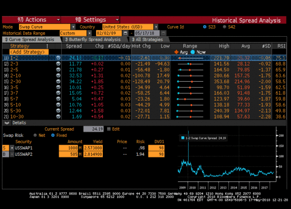
curves going back 10 years (the bonds we will be discussing use the forward swap curve for their coupon calculations as opposed to the actual yield curve, we will be utilizing charts that show both and they tend to move together with a slight lag in the swaps curve). On the left you see the various swap curves (1-2, 2-3, 2-5, etc.) and the blue is their current spread (as of 5/17/2018). So you can see the 2’s to 10’s curve was 32.53 on that day. This is expressed in basis points which is 1/100th of 1%. Sounds complicated but all this means is that if you were to purchase a 10 year treasury you would receive .32% more than if you purchased a 2 year note. If you move to the right side of the table you will see that the 10 year historical high spread was 280 basis points or 2.8% (meaning you would get 2.8% more for buying a 10 year bond than a 2 year). The average has been 157 and the low was 17.49. Clearly we are currently near the lows. You can look at each curve for the historical information for that swap curve. If you look at the range column, the red mark represents average and blue is were we are now. You will note that nearly every curve is at historically low levels and several standard deviations away from the mean.
So why is this important? Well if we are analyzing bonds whose coupon resets based on the spread difference in the swaps curve, and they are trading at significant discounts, this tells us that we are historically and statistically low spreads and likely close to a bottom. Historically, an inverted or very flat yield curve has signaled stock market tops and been a great forecast of future recessions.
NEXT PAGE: HISTORIC YIELD CURVES AND THE STOCK MARKET
The chart below shows the 2’s to 30’s yield curve and the performance of the Dow Jones Industrial Index. 
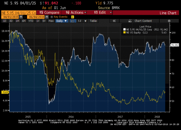
The current 2’s to 30’s yield curve (not swaps) is 57.60 basis points and you can see we have been in a straight line down since 2014 moving from over 300 basis points to 57. This means investors are currently receiving only .57% for locking in their money for an additional 28 years. Why would any sane person do that? The answer is speculation. If you are purchasing long bonds now you certainly aren’t doing it for the extra 57 basis points but because you believe rates will fall and the price of the long bond will increase. This generally happens when there is a crisis or a recession looming, so considering the trillions in long bonds that are outstanding a lot of people must have that view. Given the intervention of global central banks there are some other factors that have been driving spreads lower but the major reason is the belief that we will have low inflation and muted economic growth. If you take 30 seconds to study this graph, you will note the uncanny relationship between a flattening treasury curve and stock prices (represented by the yellow line). In every instance, you will note that as the curve has flattened stock prices have risen. It looks fairly muted in some periods due to the scale of the graph but lets look at a few data points for perspective. In the early 1990’s the curve was near 400 basis points and the Dow was around 2500. You can see as the yield curve fell from 400 basis points to its eventual low of -54 basis points (inverted), the Dow ran from 2500 to over 11,000. The yield curve made a low in March of 2000 and within months the Dow began a decline of about 30% to 7500. Notice how quickly the yield curve steepened, it went from -54 in march of 2000 to 270 in September of 2001. It took almost 10 years to fall and 1.5 years to move almost all the way back. In 2004 the curve peaked at 342 basis points and note that right as it began to fall the Dow made a major move up from 10,000 to almost 13,000 in 2 years from 2005-2007. Once again, within months of the curve bottoming, the stock market peaked and began a major decline during the credit crisis from 13,000 to around 7,000. Her again, notice how quickly the yield curve spiked up going from basically zero to over 250 in one year. Finally, notice where we sit today. The divergence between the yield curve and the stock market has never been higher and once again the curve appears to be forming a bottom. Certainly it could go lower and possibly invert over the short term, but if history is any guide we should be getting close to a bottom and once we hit bottom it won’t be long before we see a dramatic shift higher in the yield curve and a major move down in stocks. With this background, it is now FINALLY time to reveal the trade opportunity and analyze the actual bonds.
NEXT PAGE: THE BIG OPPORTUNITY?
Why This Idea Makes Sense NOW
To recap we have reviewed some historical bond opportunities that hopefully illustrated some of the unique opportunities the bond market can periodically present investors that have the right timing, knowledge, and access to the opportunity. We looked at some of the nuances that differentiate the bond market from other financial markets and we examined the yield curve and is should be clear that we are historically on the low end and that it doesn’t tend to stay this far below average for long. Now let’s put this all together to determine if this is one of those rare opportunities and analyze some actual bonds.
Why Now?
While it is impossible to pinpoint exactly when the yield curve will bottom and how long it will stay there, I believe there are several reasons why it makes sense to begin to leg into this particular trade. We will examine the structure of individual bonds shortly but the important thing to understand from a timing aspect is that most of these bonds have zeroed out – meaning the coupons have already gone to zero and investors are not currently receiving interest payments. Many of the bonds are being priced as if they will pay a zero coupon for life and an investor can buy the bonds with spreads to the treasury of approximately 1% assuming it NEVER pays a coupon for the life of the bond. Since the coupon cannot go negative most of the price damage has been done and these bonds are trading at 30-50% discounts from their issue price. The 10 year treasury is currently 2.90%, many of these bonds can be purchased with yields over 4% as a zero coupon. This means if the yield curve does something it has never done in history and stays at or below these levels for 10 years the yield would still be 4%. That is the downside, worst case yield we will receive as long as the issuer does not go bankrupt before maturity!!! It should be relatively obvious looking at the historical yield curves and swap rates that at some points over the next 10 years we should receive some coupon. And if history repeats and the yield curve eventually normalizes, it is likely at some point we should get a rather large coupon and many of the structures have a high probability of capping out meaning at some point we could get coupons as high as 10-13%. Of course, at this point the issuer would likely call the bond, which since the bonds are trading at such deep discounts would be the best possible outcome for investors.
Why Isn’t the “Smart Money” In This Trade?
The answer to this is twofold. First, as we discussed earlier these are geared to retail and issued in very small quantities. It is difficult to find large blocks of these bonds and in fact they tend to trade in sizes from $10k – $200k. It simply isn’t feasible for an institutional investor managing billions to get involved when they can’t possibly get enough size to make the research and trading effort worth their time. The other reason is theses bonds have a very wide bid/ask spread and the pricing services often price them far below where they actually are trading. Since bond managers are generally measured against an index and are under intense pressure to outperform their peers, it is very difficult to purchase a bond at $64 and have the pricing service price the bond at $60 and have to book an immediate 4 point loss into their performance numbers. Sure, a year from now if things go the way we expect the bond might be the home-run of a lifetime but in the meantime they would be reporting performance below their peers – and in a business were the name of the game is growing assets, no manager wants to risk short-term performance for long-term gain. If you saw the movie or read the book The Big Short, this was the exact problem the Christian Bale (Michael Burry) character faced, he knew he would be right but his investors saw the short-term performance and wanted their money back!
Bond Structure
These bonds are issued by almost all the major financial institutions. The bonds we are interested in have stated final maturities of 10-15 years and all are investment grade rated. The coupons are calculated using a formula based on the yield curve. The parts of the formula are:
The formula can be expressed as: M x ((S1 – S2)- St) and while it may seem complicated a few real life examples will show it is actually very easy.
There are many variations of this formula but these are among the most common. Working through the formula you will find that all else being equal you would prefer a higher multiplier off the widest curve and no strike. (so in the example above all else being equal bond 3 would give the investor the best chance of getting the highest coupon at the quickest rate since 30’s to 2’s is usually the widest curve and it has a higher multiplier (5.5 vs. 4). Of course, the price of the bond is determined to a large extent by the formula. Formulas that are more likely to get a coupon more quickly trade at higher prices. The bonds that do not have a strike will have a coupon unless the yield curve is inverted. The table below show several bonds with the applicable parts of the formula (swaps curve, multiplier, strike, cap), and the coupons/yields using the current and historical average. 
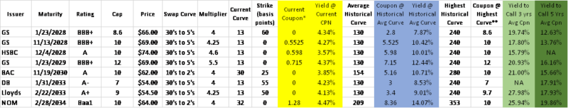
Bond #1 is a Goldman Sachs with a maturity of 01/23/2028. The yellow shaded columns are the current coupon and the yield to maturity assuming the coupon never changes. This bond has a yield of 4.34% as a zero coupon for life. The 10 year treasury is currently 2.93% so the worst case yield on this bonds offers a spread of 1.41% over the treasury. The blue areas show the coupon and yield using the 10 year average swap rate (130bps), here the coupon would be 2.8% and the yield to maturity would be 7.87%. Using the historical widest curve in almost every case the coupon caps out. I did not run the yield to the maximum coupon because it is likely the issuer will call them at par ($100) as opposed to paying a 9+% coupon. This brings us to the green shaded areas. If we are nearing a bottom in the curve historically it doesn’t remain there long meaning we should be no more than a few years away from a dramatic steepening where these bonds hit their caps and likely get called generating 15%+ returns.
In summary, we believe yield curve steepening bonds are presenting investors with a rare opportunity and represent one of the best risk/return profiles we have seen since the credit crisis. These bonds have many of the features of historical bond opportunities – they are currently out of favor and hated by the original investors who have taken significant losses and are looking to dump, they are a small niche within the corporate bond market and hence are too small to attract the interest of large institutional investors and are almost certainly unknown to most retail investors. Most importantly, they are trading at significant discounts to issue price which is strictly due to the falling coupon and has nothing to do with the credit-worthiness of the underlying issuers. To close, let’s review the investment thesis and risk factors
Investment Thesis
Negative Considerations – Risk Factors